- Home
- Project Portfolio
- Project Portfolio Dashboard
Project Portfolio Dashboard
Published: 2011-02-17
Last updated: 2022-03-16
A project portfolio dashboard supports the executive level and general management of an organization in monitoring and controlling multiple projects. In contrast to the project management dashboard of an individual project, it summarizes key performance indicators of virtually all projects the organization is undertaking.
Most Important Elements
As general manager of an organizational unit, what would you want to know about the projects in your unit? The quick and simple answer is: Are they on track or not? And for those which are not - what are the problems, how do these problems affect our organization or business and what can we do about them? But a project portfolio dashboard must show more than only the present status and present problems of projects being processed. It should also serve as planning support and “pre-warning system” for the organization, corresponding to its key performance indicators (KPI’s), and as such, is a guideline to how we have to set up each project's controlling tools.
Take the following list as basis which you can adapt and extend to your needs.
- Overall picture of all projects on track, with minor issues, or off track
- Scope: are project work and results in line with requirements or expectations?
- Schedule: which projects are ahead of, within or behind schedule?
- Budget: project revenue, cost, profit
- Present and planned utilization of resources
- Project risk exposure
- Project changes
- Open claims
- Stakeholder satisfaction, including customer satisfaction and team member satisfaction
- Strategic alignment and changes of priorities of projects
- Implementation and standardization of project management processes
- Innovative ideas coming out of project work
- Lessons learned of completed projects to support future projects
- etc.
It is quite helpful to illustrate these KPI’s in a graphical form. Here are some examples.
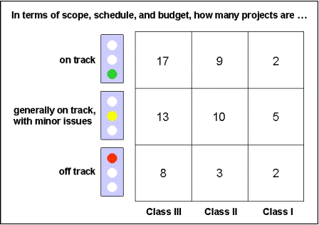
Overall Picture
Based on earlier project prioritization, we have an example portfolio of 9 class I projects, 22 class II projects and 38 class III projects. The overall picture of our project portfolio dashboard shows that 3 of the class II projects and 2 of the class I projects are off track, 5 of our class I projects have minor issues, etc.
Project Scope
On our project portfolio dashboard we want to recognize issues in terms of project scope, that is, problems with obtaining required or expected work results, but also, innovative or extraordinary clever solutions. We cover both areas with a qualitative analysis which we can delegate to lower management levels. On the top management level, we only need to see executive summaries that show problems proposed solutions, critical constraints, threats and opportunities for our organization and business that give us a basis for decision making.
Project Schedule
For each project, we know earned value to date (EV) and compare it with planned value to date (PV) which gives us the schedule performance index (SPI):
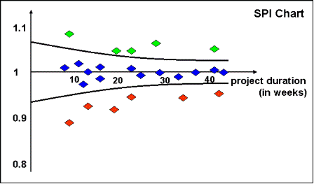
In general, most of our projects should have an SPI close to 1, meaning that they are on schedule. On our project portfolio dashboard we summarize all SPI's in a graphical representation:
This chart shows that 6 of our projects are currently behind schedule (red dots), 5 are ahead of schedule (green dots), etc. If we collect these charts with their underlying data and compare them on a monthly or quarterly basis we can recognize trends how good - or bad - we are doing as an organization in terms of schedule performance.
Project Budget
In sub-section Planning the Project Budget we consider two aspects: project revenue and project cost. Here, we add another one: project profit.
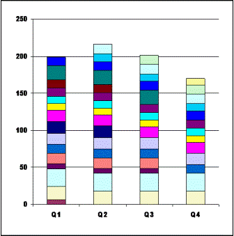
The first aspect is project revenue (or volume). This is easy to track: we just add up project revenue of each project to obtain portfolio volume at a given time. Then, we can draw a simple chart with portfolio volume over time.
It shows different columns by quarters and in each column all the projects at that time in different colors. There seems to be a trend of decreasing overall volume - maybe, a good reason to talk to our key account and sales managers.
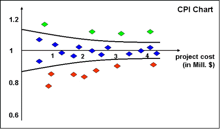
The second aspect is project cost. We know actual cost to date (AC) and compare it with earned value to date (EV) which gives us the cost performance index (CPI), for each project.
Again, most of our project CPI's should be close to 1, meaning that they
are in budget. A summary of all CPI's on the project portfolio
dashboard could look like this:
Here, we seem to have 7 projects in our portfolio that are in trouble, 4 that are performing better than planned, all the others are on track. If we compare these charts on a monthly or quarterly basis we can recognize trends in terms of improvement – or deterioration – of our cost performance as an organization.
The third aspect is project profit.
If we know planned value (PV), earned value (EV) and actual cost (AC)
for each project at a given time, we can estimate or “predict” its
profit at project completion:
assuming that the current trend of how earned value and actual cost develop for the remainder of the project duration continues (note that the above formula leads to a very conservative prediction). Usually, we express profit as a percentage:
When summarizing these predicted rates of profit of all our projects in one chart of our project portfolio dashboard, comparing predictions given at two different reporting dates, we could obtain something similar to this:
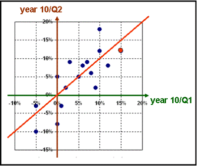
For example, there is one project in our portfolio (red dot) that has a predicted profit of 15% in quarter 1 of year 10 and 12% in quarter 2 of year 10. Observe how the predicted profit of that project changes from one reporting period to the next, by clicking the control buttons. See also how the profit predictions of our portfolio as a whole (the “cloud of dots”) developed over those five quarters.
Resources
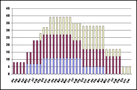
A major constraint of most organizations is the limitation of resources, especially when it comes to human resources (HR). Therefore, it is essential for a project based organization to have a clear picture about whom they need for what period of time. If we have manpower histograms as part of the planning results for every project we are able to summarize them into one portfolio histogram. The following example is a summary of three projects - “Red”, “Blue” and “Yellow” - that shows how many, let us say, mechanical engineers of a certain skill level we need over the next three calendar years.
This can be another part of our project portfolio dashboard, serving as one important element of HR planning and controlling.
Risk Exposure
Our project based organization will have a certain exposure to risk. In each of our projects we perform risk analysis in planning phase, resulting in
- additional work integrated into the project scope, schedule and budget, and
- residual risk which we have to take as an organization.
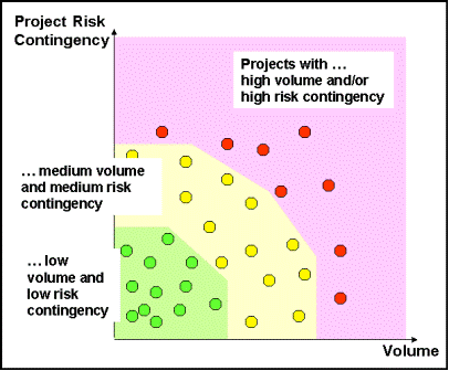
For that residual risk we create project contingency. By pro-active risk management during implementation phase and closure phase of each project, we repeat risk analysis periodically in order to identify risks that disappear and risks that arise. As a consequence, we resolve corresponding parts of the project contingency, or create new ones, respectively. In order to monitor our project-related risk exposure we can integrate the following chart into our project portfolio dashboard.
This example suggests that there are eight projects that deserve high level management attention in terms of risk management. If we compare these charts on a monthly or quarterly basis we can recognize trends in our risk exposure as an organization.
General Remarks
We would like to encourage you to design your own project portfolio dashboard based on those key performance indicators that are important in your organization.
Such a dashboard cannot replace goal-oriented, clear, and smooth communications taking place in an atmosphere of mutual trust among all members of the organization. Especially, this last aspect of mutual trust is essential for getting clear and real pictures in our "project portfolio control center". Whichever nice IT-based tools or graphics we use, the outcome of them will only be as good as what we feed into them.
For details of concepts not explained here, please refer to
Project Planning Phase: there I cover planning the project pudget, the project management dashboard, controlling tools including schedule performance index (SPI) and cost performance index (CPI), risk management and risk analysis
Project Closure Phase: for the topic of customer satisfaction35+ templates, tools, and checklists in one set
To save you time in your daily work as a project manager, I packaged more than 35 project management templates, tools, and checklists into one zip file.
- You un-zip it, and you get all items in formats you can edit to your requirements.
- They strictly contain only standard functionality and no macros or other code.
- You are allowed to use your logo.
or click here for more info.
Return to Project Portfolio Management
Return from Project Portfolio Dashboard to Home Page
|
|
|





Your Comments
Have your say about what you just read! Leave me a comment in the box below.